
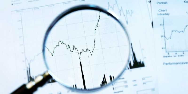
Share trading is all about ‘MONEY’. It is very important that you understand shares, stocks, prices and various other elements related to them, ‘price’ being one of the most important factors. A great share/stock could be prone to making losses if it is bought at a wrong price. For this, you need to understand price and charts. Technical analysis all about recognizing and getting the price right. Technical analysis is a method for analysing the market data and predicting the movement of stock/share price. Traders are of the opinion that the future price movement greatly depends on the current and past market trends. This chart is called the stock chart or the share chart. It is very important to have a stock chart in place to perform the technical analysis and hence it is important that we learn how to read these charts.
First, we need to understand what stock charts are. Stock charts are basically graphs that help plant points of how stock/share price and trading elements have changed over a period of time. This data can be presented with the help of different charts. It depends on the trade analyst to identify and choose the type of technical charting that will provide the best and effective results. Like any other chart, a stock chart also has two axes – horizontal and vertical. The horizontal axis representing the time period and the vertical axis representing the stock price or other trading elements corresponding to the time period. For the purpose of technical analysis, many types of charts are used. However, the most used types of charts are line charts, bar charts, and candlestick charts.
- Line Chart – Line chart is a basic type of chart. Creating a line chart is a 2 step process where one has to plot the closing stock price corresponding to the date and once the same is done for all dates, you need to connect these dots with a line.
- Bar Chart – A bar chart is a group of bars, with each bar showing price movements for a given time period. Each bar has one vertical line on either side that shows the highest and lowest price reached during the period. A bar chart provides more information than a line chart. The higher the difference between the opening price and closing price, the longer would be the bar.
- Candlestick Charts – A candlestick chart is similar to a bar chart except that a candlestick chart makes use of blocks instead of line-like bars with the upper line representing the day’s highest trading price and the lower line representing the day’s lowest trading price. Candlestick charts also make use of colour shades – mostly black and white to indicate which price was higher during the day – opening or closing.
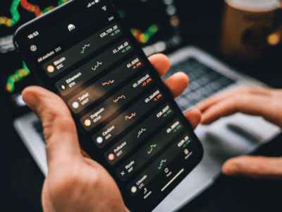
There are a lot of applications that provide technical analysis on their platform. Most investors use a trading app to access technical analysis of their stock market trading decisions. It is important that we keep in mind that no technical analysis is 100% perfect or accurate. A smart trader should know how to identify red flags of incorrect indicators.